Adding Value to Remote Learning with a Focus on User Experience
How we used UX Design to make remote learning more interactive and engaging, addressing the challenges of Elementary School students in the post-pandemic context.
🧩 The Current Landscape
How can we offer attractive and high-quality remote learning that increases student engagement through a virtual platform?
According to the online magazine Agência Brasil, based on a report by Grupo Rabbit, private schools in Brazil lost around one-third of their enrollments during the pandemic.
Several factors contributed to this phenomenon:
- Financial difficulties faced by families, making it impossible for students to remain in private schools.
- Lack of engagement from both parents and students in the face of monotonous, improvised online classes.
On the other hand, Brazil has become a target market for major startups such as BYJU’s, which invests in online learning platforms aimed at developing the “skills of the future” in children and young people. The Indian edtech forecasts that Brazil will become its second largest market.
For the school administrators in question, the success of the business depends on keeping pace with changes in the education market — enabling them to serve a greater number of students with higher-quality learning, thereby reducing dropout rates. One of the main obstacles to achieving this success is the lack of an engaging remote learning platform that appeals to students and can be used to complement the standard in-person school curriculum.
📈 Business Objectives
Using the SMART methodology, we defined the key business objectives:
- Specific: Implement a remote learning platform that complements the regular in-person curriculum.
- Measurable: Recover one-third of the students lost during the pandemic.
- Achievable: Educate more students with higher quality in remote learning.
- Relevant: Add value to remote education through an engaging and functional platform.
- Time-bound: Launch at the beginning of the next academic year.
The goal was to create a remote learning platform that could complement in-person education while being more engaging through active learning methodologies where the student takes a leading role. The platform needed to be intuitive and easy to use for administrators, teachers, and students alike, offering more value and knowledge to children aged 6 to 10. Ultimately, it aimed to recover one-third of the students lost during the pandemic, with a planned launch for the 2022 academic year.
👥 Users
Based on desk research and the personal and professional experiences of our team members, we outlined the main user profiles for our remote learning platform: students, teachers, and parents with students as our top priority.
🧩 User Context
One of the easiest ways to understand each persona and their context is through stories. That’s why we explored our solutions in real-life user situations, following the Pixar Storytelling framework.
Student:
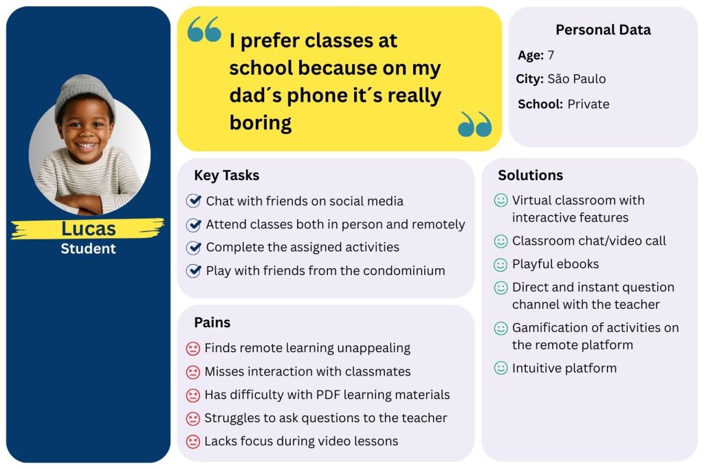
Once upon a time, there was Lucas, a 7-year-old boy who loved chatting with his friends at school and on social media.
Every day, he would go to a private school in São Paulo, and that was his top priority during the week. Lucas did all his assignments, but he always made time to have fun too.
One day, schools shut down due to the Covid-19 pandemic, and his school routine was completely interrupted.
Because of that, over time, his classes became online-only — just pre-recorded videos and PDF worksheets. That made him lose a lot of interest in school, and he started feeling unmotivated to do his homework and really missed being with his friends.
Until finally, the school administrators launched a new remote learning platform. And this time, the tool was more intuitive, the video lessons and activities became much more dynamic, and his academic performance improved a lot. Lucas was happy again with his study routine.
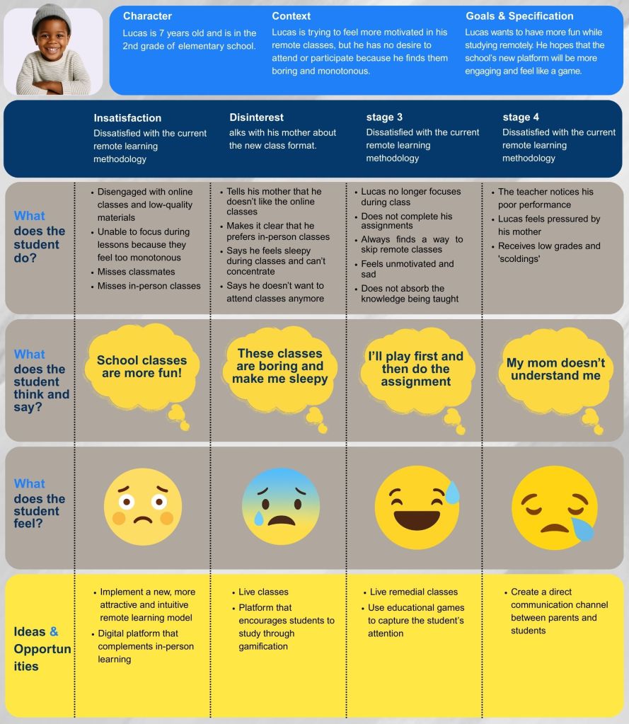
🗺️ Journey Map — Understanding Lucas’s Experience
When we set out to design EduCoruja, one of our first steps was to deeply understand the student experience in remote learning. To do this, we created a Journey Map based on our primary persona, Lucas — a 7-year-old in the 2nd grade who is struggling with the current online learning model.
This Journey Map became more than just a visual tool; it helped us trace Lucas’s emotions, actions, and thoughts across different stages of his learning journey. By mapping out his frustrations — from boredom with monotonous classes to feelings of isolation and disconnection — we were able to clearly see where the learning experience was breaking down.
Understanding these “pain points” was essential. It allowed us to identify opportunities for improvement that go beyond technical solutions, focusing instead on making the platform engaging, intuitive, and emotionally supportive. Every stage in Lucas’s journey revealed clues about how to design features that motivate him to participate, enjoy, and learn effectively in a remote setting.
This process also aligned the entire team on the same goal: creating a platform that feels less like a duty and more like an interactive, rewarding experience. In short, the Journey Map gave us the empathy and clarity we needed to design EduCoruja not just for students like Lucas, but with their real challenges and needs in mind.
First Validation Stage — Problem Analysis
As we developed our personas and mapped their journeys, we needed to validate the assumptions that emerged from our CSD Matrix. These hypotheses represented potential pain points and opportunities, but we knew they had to be tested before guiding any design decisions.
Our goal was to understand, with greater precision, the challenges faced by students in adapting to remote learning — particularly in the early years of elementary school. To do this, we began with quantitative research as a starting point for our validation process.
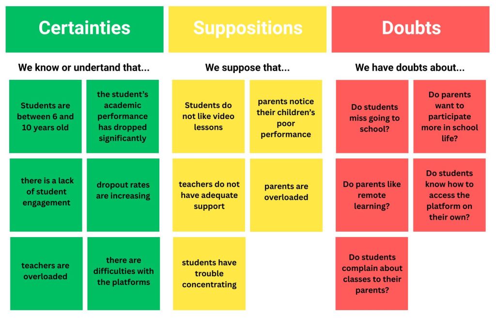
CSD Matrix — Framing the Hypothesis
Using the CSD (Certainties, Suppositions, Doubts) framework, we organized what we already knew, what we assumed, and what we still needed to find out.
- Certainties: Students aged 6–10, declining academic performance, lack of engagement, growing dropout rates, and teacher overload.
- Suppositions: Parents notice low performance, teachers lack support, and students struggle with focus.
- Doubts: Do students miss in-person school? Do parents approve of remote learning? Can children navigate platforms alone? Will remote teaching be accepted post-pandemic?
The CSD Matrix served as our blueprint for designing research questions and deciding which hypotheses needed stronger evidence.
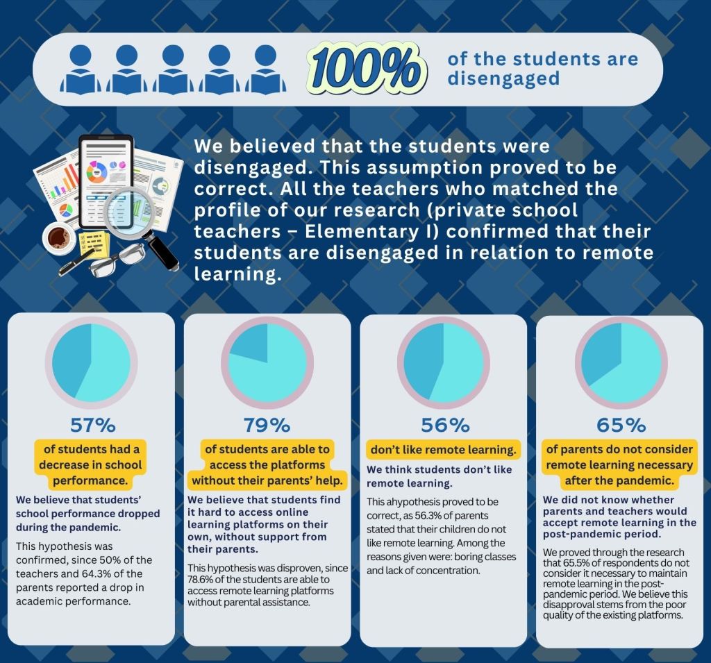
Quantitative Research — Measuring the Problem
We created two Google Forms questionnaires: one for private elementary school teachers and another for parents of students. Distribution channels included social media, WhatsApp groups, and direct messages.
While the reach was modest — 23 parents/guardians and 11 teachers — the results were revealing:
- 100% of students were considered disengaged.
- 57% experienced a drop in academic performance.
- 79% could access platforms without parental help.
- 56% didn’t like remote learning.
- 65% of parents and teachers didn’t see remote teaching as necessary post-pandemic.
These figures confirmed disengagement as a critical issue, but numbers alone couldn’t explain why students felt disconnected.
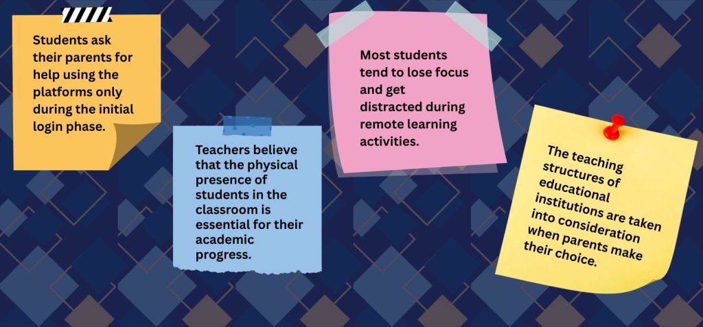
Qualitative Research — Understanding the “Why”
To uncover the underlying causes, we conducted interviews with three teachers and three parents. Since our audience was primarily children, speaking directly to their parents gave us a more accurate picture of the daily struggles and emotional toll of remote learning.
Through these conversations, we identified:
- Emotional fatigue from prolonged screen time.
- A strong preference for in-person interactions.
- Difficulty maintaining concentration during online classes.
- The feeling of being unsupported by the current remote learning structure.
💡 Insights
After conducting both quantitative and qualitative research, we were able to go beyond assumptions and uncover deeper insights into the real challenges faced by students, parents, and teachers during remote learning. The surveys gave us measurable trends about engagement, performance, and attitudes toward online education, while the interviews allowed us to capture emotions, frustrations, and expectations that numbers alone could not explain.
This combination of data helped us identify key pain points — from lack of motivation and low-quality platforms to the emotional burden on families and teachers. More importantly, it revealed opportunities to design solutions that are not only functional but also human-centered, making remote education more engaging, supportive, and effective for all stakeholders.
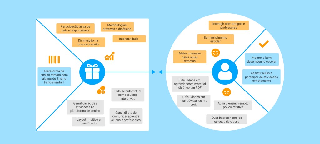
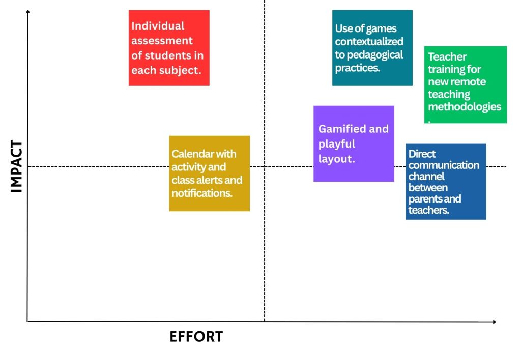
🛠️ Alternatives
After analyzing the results of the applied research and understanding the users’ pain points and frustrations, we concluded that the lack of student interest is mainly due to an unappealing platform and the absence of interactivity between parents, students, and teachers.
Moreover, recognizing that in-person education is essential — and that it should be fully restored after the pandemic period — the platform to be developed must not detach itself from the face-to-face model. Instead, it should complement and support it, facilitating the teaching and learning process.
With this in mind, we sought to better understand what should be prioritized when shaping the solution for our product. To do so, we created an impact vs. effort matrix, focusing on the students’ lack of interest and the limited interactivity among the parties involved in the classes. According to the collected data, both teachers and students struggle to capture and maintain attention during lessons. Furthermore, interactivity and ease of use within educational platforms, as highlighted in the interviews, are among the most decisive factors for parents when choosing a school for their children.
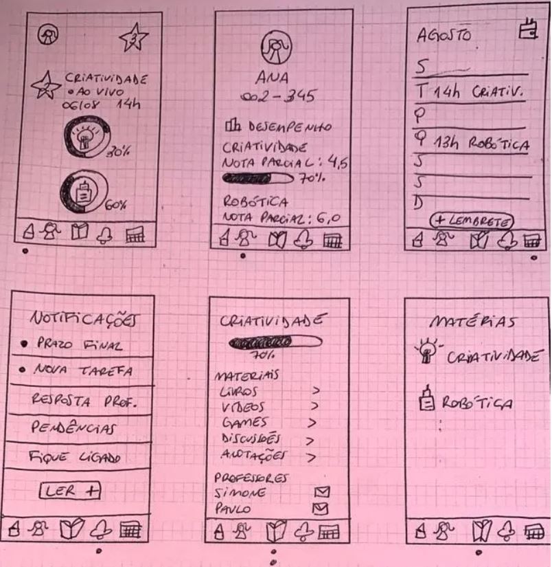
✏️ Sketches
Before moving to digital wireframes and later high-fidelity prototypes, we started with simple sketches on paper. This stage followed the principle pencil before pixels, helping us quickly visualize ideas, test flows, and align as a team before committing time to polished screens.
The goal here wasn’t to make things beautiful, but to make ideas tangible. By sketching, we could explore different possibilities, spot potential issues early, and agree on which features had the most value. These paper prototypes worked as the foundation for everything that came later in the EduCoruja project.
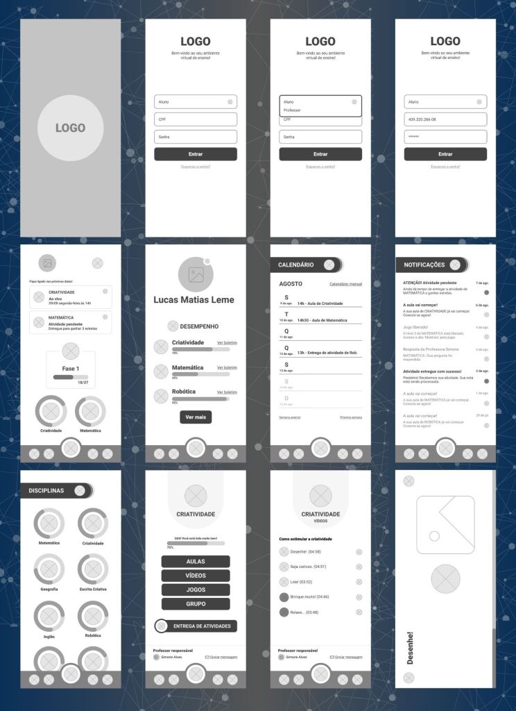
📐Wireframes
After sketching out our first ideas on paper, we moved on to building the wireframes. This was the stage where the project really started to feel more concrete — no longer just scribbles, but a structured skeleton of what EduCoruja could become.
Wireframes gave us the chance to organize the information hierarchy and define how each screen would connect with the next. At this point, aesthetics weren’t the priority; instead, we were focused on clarity, usability, and making sure the flow made sense for our three main users: students, teachers, and parents.
This step also helped us refine and prioritize features — deciding what was essential to keep students engaged and how to make the experience as intuitive as possible. In short, wireframes were the bridge between raw ideas and the first version of the product that users could actually “walk through.”
🎨 Style Guide
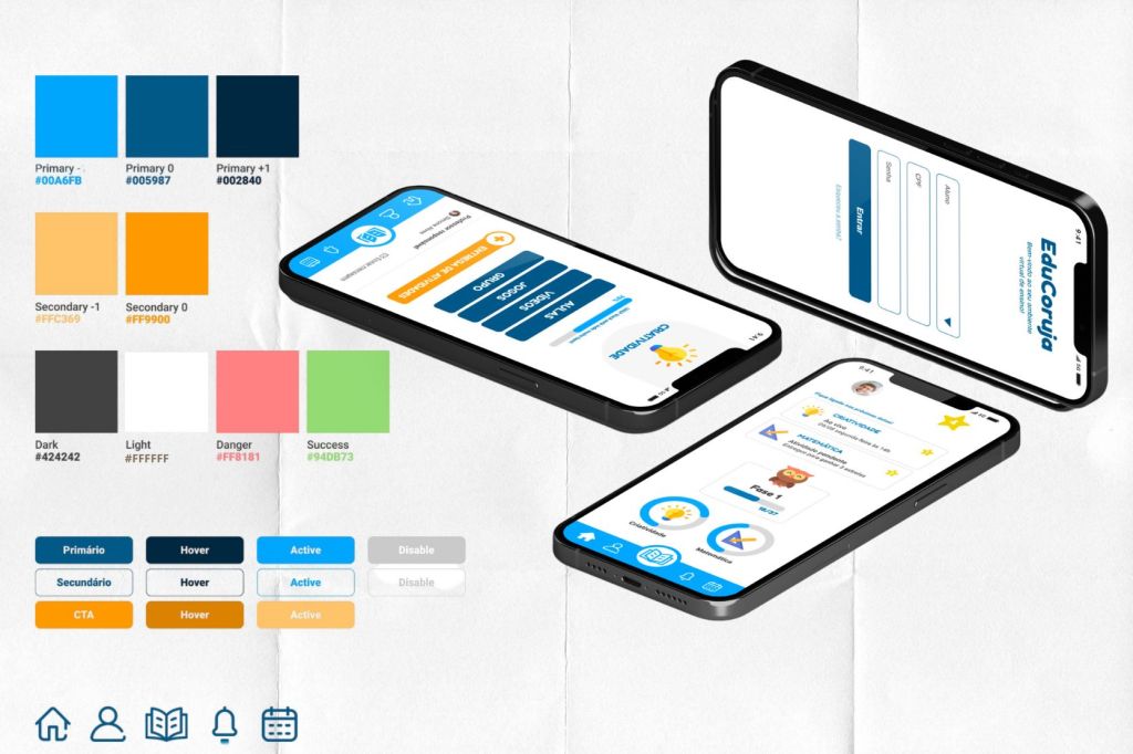
After defining priorities, we moved on to creating the style guide, aiming to give EduCoruja a cohesive and recognizable visual identity.
All graphic decisions were shaped around our main persona: the student. Blue was chosen as the primary color because it conveys technology, innovation, and achievement while also being accessible for users with color blindness. Orange was introduced as a complementary tone, bringing contrast and energy to the interface. Together, these two colors form a strong balance, standing out clearly in the chromatic circle.
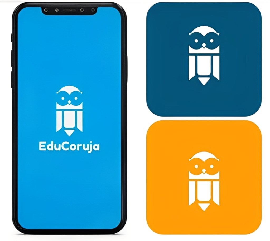
For the logo, we chose the owl—a symbol of wisdom but also playful enough to connect with younger audiences. In typography, we leaned on the Innocent archetype, adopting Fredoka and Roboto for their clean legibility and friendly curves. Rounded icons were designed to reinforce intuitiveness, with the same playful style extended to progress bars, charts, and buttons—creating an experience that feels closer to educational games.
To ensure inclusivity, the style guide also focused on accessibility standards such as contrast ratios, font sizes, and consistent use of visual cues. This not only guarantees usability for children but also helps teachers and parents navigate the platform with ease. Finally, the defined system of colors, typography, and iconography ensures consistency across multiple devices, making EduCoruja a seamless experience whether on desktop, tablet, or mobile.
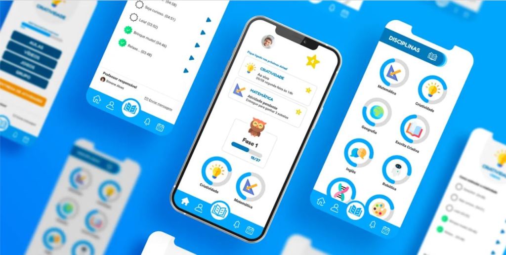
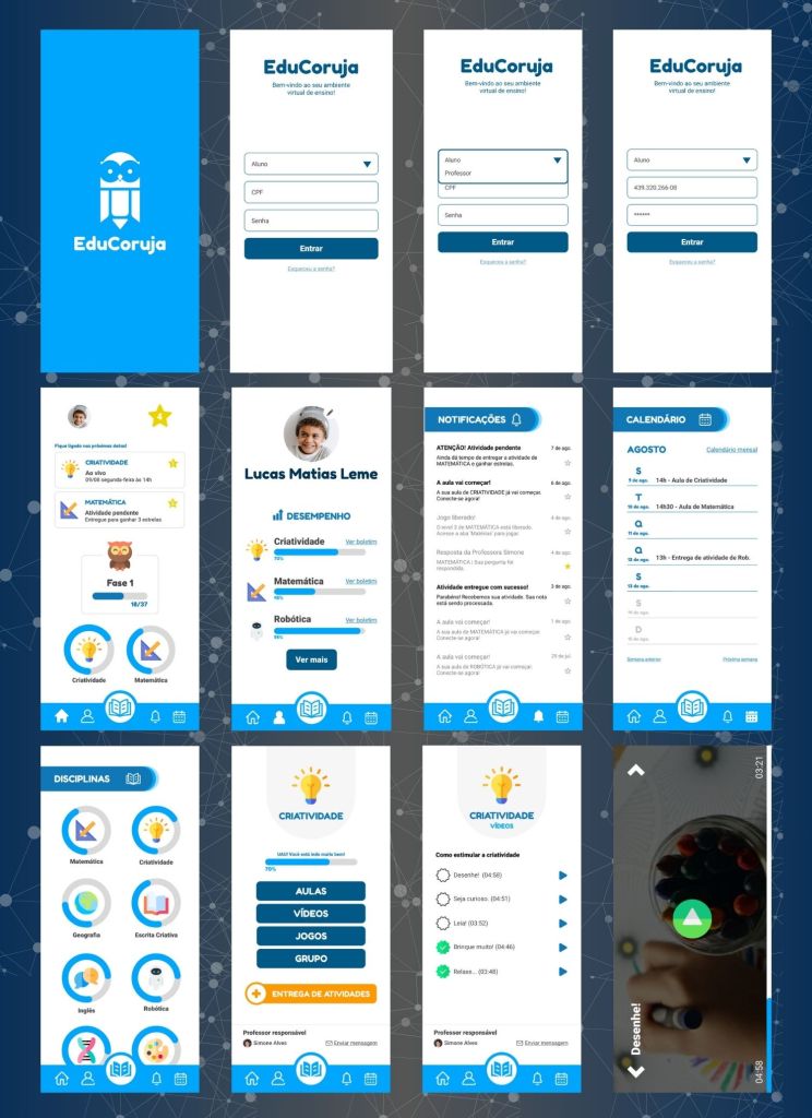
📱 High-Fidelity Prototype
With the sketches (low-fi wireframes) and the style guide defined, we moved forward to design the high-fidelity prototype in Figma.
At this stage, the goal was to bring the platform to life, combining the playful visual identity with clear usability flows. Every decision was centered on our main persona — the student — so the interface feels intuitive, engaging, and easy to navigate, even for children between 6 and 10 years old.
The prototype simulates real user interactions: from logging in, to accessing subjects, completing activities, and tracking progress through gamified dashboards. We tested different layout solutions, ensuring that the visual consistency and accessibility established in the style guide were fully integrated into the user experience.
This prototype was also crucial to validate how teachers and parents would perceive the platform, since they interact with the system differently from students. By creating a realistic simulation in Figma, we were able to gather feedback and identify opportunities for improvement before development.
🔗 Explore the Prototype on Figma:
👆 Usability Testing
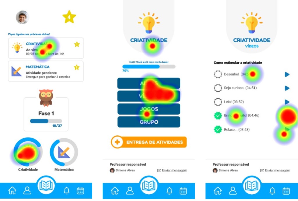
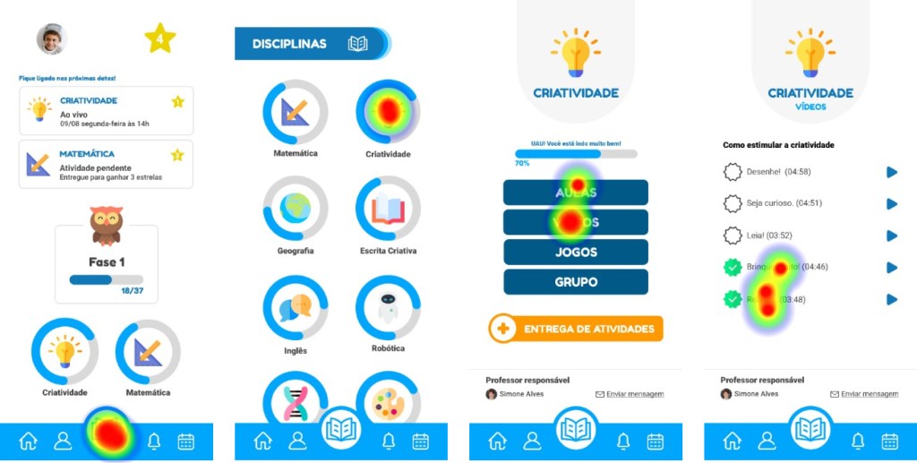
To validate our high-fidelity prototype, we conducted a remote usability test with 8 users, using Maze to collect interaction data and click heatmaps.
The mission was simple: “watch a creativity class video.” We designed two possible paths to complete this task and observed how children interacted with the interface.
The tests revealed valuable insights. For example, in the subject frame, the buttons “Classes” and “Videos” were often interpreted ambiguously. Adding icons or merging both categories into one could improve clarity for children still learning to read. Out of the seven child participants, only one required parental assistance, since they were in the early stages of literacy — highlighting the need to further adapt the platform for pre-readers.
On average, the tests lasted 48.9 seconds, providing a quick yet powerful snapshot of how intuitive the platform felt for first-time users. These results gave us clear opportunities to refine the design and confirmed the importance of testing with real children in their natural context.
⏭️ Next Steps
For EduCoruja to become a real product, a few important steps still need to be taken:
- Conduct deeper quantitative and qualitative research to better understand the users’ pain points and refine the value proposition.
- Collect insights on technical feasibility and cost analysis to present a clear picture for potential investors.
- Track and evaluate results, data, and key metrics to validate the product’s viability and guide future iterations.
These next steps are essential to move EduCoruja from a prototype into a sustainable and scalable solution that can truly support children, parents, and teachers in the post-pandemic educational context.
🔑Conclusions & Learnings
By challenging ourselves to better understand remote education during the pandemic, we realized how vast and rich the educational landscape really is — and how distance learning has pushed us closer to the future, encouraging the development of new skills that are still undervalued today.
Throughout this journey, it became clear that the sudden shift to digital created discomfort and communication gaps among students, teachers, parents, and school administrators. That’s why we chose to focus on the ones most affected: the students.
Our goal was to design something intuitive, dynamic, and accessible to reduce the difficulties students face. Still, as with any early-stage product, usability testing revealed the need for adjustments. Feedback highlighted, for instance, the importance of adding supportive icons for pre-literate children, showing us that small changes can make the experience more inclusive and meaningful.
This project taught us that designing for education is not just about creating a digital tool, but about bridging emotional, cognitive, and social gaps through thoughtful, user-centered design.
🤝About Us
This project was created by Filipe Monnerat, Julia Sotiropoulos Dante, Ketlyn Souza, Belisa Carvalho Guedes, and Thais Borges, during the UX Unicórnio course led by Leandro Rezende.
It was the result of teamwork, collaboration, and a shared passion for exploring how UX Design can bring real value to education, especially in moments of change and uncertainty.
